How to make Popups that do not annoy your visitors
We all hate pop-ups. They are like having a conversation with someone and a sales person keeps popping into the conversation. But as marketers know, you can increase leads from 10% to 40% if they are done right and are a pleasant experience for the visitor.
What makes popups annoying?
- Triggering at the wrong time – For example before you have had time to read the first sentence of a web site. Read more about triggers here
- Having an irrelevant offer – Website visitors are in different stages of a sales funnel. Don’t offer a closing deal when they are still exploring the concept of your service or product.
- Assume you are moron – Be careful using popups that ask a yes or no question which has an obvious answer. For some target markets, this is a negative experience. For example, on a security site: “Yes – tell me more” and “No – I want my site to be hacked and for me to be fired.”
- Visitors lose control – Visitors like to be in control and explore the site at their own pace. Popups interrupt the experience and leave a bad impression.
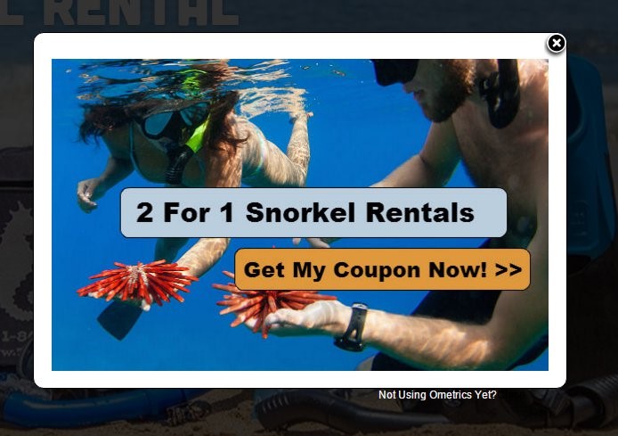
- Too large on the screen – Popups like IPVanish discount code, target coupons, or any other coupons may annoy you, when appearing too large on screen without an option to exit. So, you should always avoid having too big of a screen coupon or offer messages.
Keep the pop up offer relevant
Use the proper trigger to capture the visitor’s attention at the right time. For example, an exit triggered pop-up works well to reinforce the main offer of a trial or offer. Users often respond when you ask a question twice. There is no risk if they are leaving the site to ask one more time.
Another example is to trigger your offer when you know the user is more committed and further down the sales cycle. Triggers to considers are:
- Second time to the website
- 3-4 pages into the site
- Only on a page deeper in the site
- After they have been on the site for five minutes
Not all popups need to be full screen
If your visitors are highly sensitive to a pop up, then use a Lead Slider or Offer Slider. This is a small window that slides over from the side or bottom and provides information such as an offer or a simple question with a form.
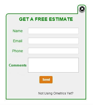
The advantage with lead sliders and offer sliders compared to a full screen model type pop up is they can be minimized and opened up again later. This allows the visitor to continue on the site and then open the offer / coupon or setting up an appointment when the visitor wants. Users like to be in control of what they are doing. Lead sliders also have worked well on mobile devices.
Remember the mobile user experience
Depending on your site, you could have over 50% of your visitors using a phone especially for email campaigns and ads from Facebook. There are a number of issues with mobile such as font size, download time, ability to enter text /type, and the multiple sizes of device screens.
To have a friendly experience on a mobile device:
- Keep the download time as fast as possible by reducing images and just use text.
- Keep the width of the popup at your least common denominator, usually 320 pixels wide. It is ok if they have to scroll for the height since mobile users are used to scrolling, but try to avoid it if possible.
- Reduce forms to the least number of fields as possible. This is true for all forms but especially on mobile. You can have a different form for desktop than mobile.
- Hard to understand – Make your text simple and clear. It should be able to be read within seconds. An offer on a mobile screen is read like a billboard ad on a highway… you should be able to read it in blink of an eye.
Google announced an algorithm update that will reduce the organic positioning of mobile pages if you have full screen pop-ups. The new algorithm takes effect January 2017. Find out more from our early blog here.
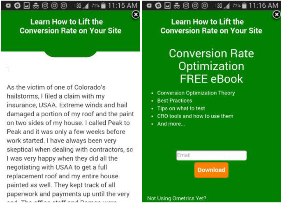
The short version is you can no longer use full page pop-ups on mobile if you want your page ranked for mobile searches. Google is improving the user experience by allowing the user to read a page before seeing a pop-up. To avoid losing rank, use a mobile banner pop-up. They allow the user to read the text and take action to view the whole pop-up if desired.
Here is an example of a mobile banner pop-up. The banner is triggered by the user’s action. The user taps the banner and it opens to a full banner.
Mobile vs Desktop Design
User experience is affected by the viewing device. Designers create a site on desktop that is coded and viewed responsively (layout change depending on the device), which means the desktop version may look great and the mobile version is an afterthought. When testing, it is important to look at the conversion rate by device. A mobile page is designed to scroll whereas a desktop page is not. This can cause conflicting results.
Try these pop-up tips and tricks on your pages to avoid annoying your visitors. Comment below about what has worked and not worked for you. Remember to keep testing your pages to get the best outcome.

- The Rise of Intelligent Websites - February 19, 2025
- Top Trending Products to Boost Your Shopify Store in 2024 - September 4, 2024
- AI Terms Glossary: Key AI Concepts You Should Know - August 22, 2024