Are you thinking about utilizing a website popup for a website landing page?
Are you concerned the risk outweighs the reward?
You are not alone in your worry. The truth is, pop-ups can be very effective, especially if you use them well and implement the very best practices. Companies are seeing as high as a 40% drop in bounce rates with conversion rates of 10% to 50% when using a popup correctly.
The key in using a website pop-up effectively is how it interacts with the user. Popups are most annoying when they appear at the wrong time during the website or landing page experience. Often pop-ups are shown right when you land on the page before you have had a chance to read the page, so the first thing you do is close it.
Pop-ups are effective because most people need to be asked twice and have something really pointed out to them. You will notice when you are in a store with a sales person they often ask you the same question a couple of times. A bad sales person won’t stop asking or asks at the wrong time.
Before we get into how to present a popup, I want to quickly go over a couple points about designing your pop-up.
- Design it like a landing page. The image points to the form.
- Keep it simple. This exit pop-up is fast to read.
- Keep the form simple. You can also test skipping a form and pointing them to a page with more details and a form on it.
- Provide benefits bullets if relevant.
- Use the appropriate CTA label to fulfill the users desire.
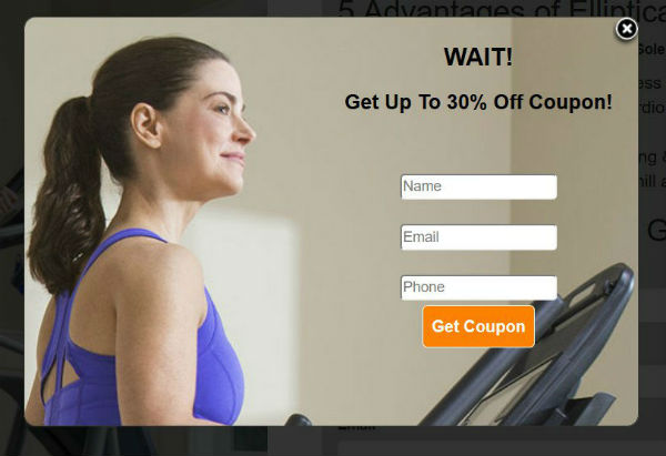
Exit Pop-Up Example
How to engage with your prospect and not chase them away.
1) Exit Triggered Pop-Ups
Exit triggered pop-ups utilize mouse-monitoring to determine cursor direction and velocity, calculating with impressive precision whenever your visitors are going to close the tab, open a different one, or hit the back button on the browser. They do not work on mobile devices since there is no mouse to track.
Exit pop-ups work very well when offering something a second time. This is because prospects often need to be asked a question twice. Best uses for exit popups are:
- Trial or demo – having a user fill out a form for a trial or demo. It is low risk and when asked a second time, you can get a 10% or more lift.
- White paper or newsletter – offering a whitepaper or PDF with helpful information works very well. It can answer the question they could not find on your site and capture them before they leave. This is also a successful way to have users sign up for a newsletter.
2) Link Triggered Pop-Ups (Click Popups)
Link triggered pop-ups activate whenever a customer clicks a text link or image in the content or sidebar of the page. The advantage of the link or click popup is the user is in control. Studies show that if a user takes an action to open a popup, they are more likely to complete the process. For example, in some cases a form on a landing page has a lower conversion rate than text or image-linked popup when it shows the same form.
Here are some successful examples of link triggered popups:
- Place text links in your copy on action words like “download the PDF to learn more” or “ the trial includes…”
- Place ad banner on the side or center section of the page. The ad image triggers the popup.
- Use the link in your navigation for “free trial” or other call to actions.
- Use text links in your emails. When emails are read in a html email browser, they can trigger the browser to show the popup.
3) Time Triggered Pop-Ups
Time triggered pop-ups appear after the user has been on the site for a period of time. You can enter any time such as 3 seconds or minutes. The actual time will have to be tested for each offer or type of popup message. This is because the popup has to match the user’s place in the sales funnel. A user in the lower part of the funnel may have the popup shown later, whereas a user in the top of the funnel that is being asked to join an email may be able to be asked earlier.
Be careful not to show your pop up too early and annoy the user. Look at your average bounce rate and use a time just before they would normally bounce. Make sure the user has time to read most of the page before the pop-up is triggered.
4) Scroll Triggered Pop-Ups
Scroll triggered pop-ups work very well to trigger an engaged user. For example, if the user scrolled halfway or all the way down the page, then we know they read the page or are looking for something on the page. This is a good time to show a popup that could provide them information they need.
- Triggering on halfway down the page – This can be used for pages that have multiple calls-to-action or pages with a lot of different images and text. Do not use this for a page full of text.
- Triggering at the bottom of the page – This is best for a page full of text. You do not want to interrupt the user from reading… breaking up their learning process as they read.
5) Mobile Popups
Because the mobile experience is very different than the desktop, the popup has to be different. The user attention span is shorter on mobile and the device presents differently. Try these tips for successful mobile popups:
- Trigger on scrolling or time on page
- Reduce your forms to as few fields as possible
- Do not use images to increase download time
- The big advantage with sliders is they are both desktop and mobile friendly and they have a “X” button to close the slider and show it later when the user wants to continue. For example, a user may not be ready for a trial or may not have a question at that time, but as they explore the site further, they may want to be contacted and they can fill out the form when they want.

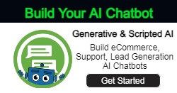
Generative and Scripted AI to engage shoppers in conversational eCommerce.
Create happy customers while growing your business!
-
1 out of 4 shoppers make a purchase on average*
-
5% to 35% Increase in AOV*
-
25% to 45% Reduction in Support Tickets
WE GUARANTEE RESULTS!
6) Popup Frequency
If a popup is shown too many times, the user can get really upset. You can control the way you show your popups by a number of different factors:
- Only shows on a specific page
- The number of times they see the popup in one session. For example, only three times.
- The number of visits. For example, the second time they come to the site they see the popup.
- Not showing it after the first time or after an action. This is important so that users do not fill it out twice. The most common setting is the popup will not show again for 30 days.
7) Page Targeting
Page targeting allows the user to experience a popup that is relevant for what they are reading. Page targeting can be setup a number of ways.
- By page or by directory – You can show a specific popup for /products/cups/ and a different once for /products/tables/ and a generic one for the home page.
- By a dynamic setting in the URL – If they do a particular search or they come to the site from a particular ad.
Other alternatives to full screen popups
Sometimes a full screen model type pop up is just too much for the user. In this case, using a Lead Slider or Offer Slider can be the perfect solution. These are small window sliders that slide from the bottom or sides of a page. They ask a simple question with a form or have a banner type offer.
 The big advantage with sliders is they are both desktop and mobile friendly and they have a “X” button to close the slider and show it later when the user wants to continue. For example, a user may not be ready for a trial or may not have a question at that time, but as they explore the site further, they may want to be contacted and they can fill out the form when they want.

- The Rise of Intelligent Websites - February 19, 2025
- Top Trending Products to Boost Your Shopify Store in 2024 - September 4, 2024
- AI Terms Glossary: Key AI Concepts You Should Know - August 22, 2024