The Conversion Rate Optimization Guide
Chapter 7
<<Previous | Table of Contents | Download the CRO Guide | Next >>
Conversion Rate Optimization Page Elements
Most sites have landing pages or a focal page like a trial, demo, or pricing type page. This section breaks down a page by its individual elements that are often tested to improve the conversion rate. Each of the following elements need to be tested separately and together to create a page with a highest conversion rate.
Title
The first thing a user looks at when landing on a site is the image and the title. The title has a couple of functions. It has to match what the user read in the ad and search terms. It has to answer their question or solve the problem they have, and if the page is on a site, the title needs to position the page for organic search ranking.
The title is one of the first elements to be tested. Try to have your tests match these goals:
- One line of text, no wrapping the text.
- The title speaks to the reader, see “Action words and subject lines.”
- Make it clear what the page solves and offers.
Sub title
The subtitle is in smaller print. It is not always necessary but can be very helpful when you cannot get your point across in the title. The subtitle often explains the result of the action of the page. Keep the subtitle down to two lines.
First sentence and benefits
The first sentence is the beginning of the pitch. It answers the user’s question and provides the solution. Following the pitch are the benefit bullets, which nail down the three to five top reasons they need to go forward and submit the form or click the CTA button. Having the benefits listed as “bullet points” creates optimal reading speed. Use one line per bullet if possible.
Tip: Ask “So What?” for each bullet. For example, change “5 day glow colors” to “5 day glow colors so you will be seen.” This can be hard to do in one line but is worth testing.
Tip: Start your bullets with numbers like “5” not “five.” Testing shows that lists and numbers have a higher conversion rate.
Call-to-Action (CTA) buttons
The call to action button is one of the most important parts of your landing page. There are a couple of elements to the button that you should consider. Back in the day, “Submit” was the de facto term used. Now that marketing has more control of websites, the submit button is slowly going away. Which do you think is more compelling?
- “Free Trial” or “Try it Free”
- “Buy Now” or “Add to Cart”
The button name should represent what the user’s true desire is. This goes back to the “Yes” model we discussed. Dig deeper into what the user really wants. For example:
- Lose weight today!
- Start increasing sales now!
- Yes, I want a good night’s sleep!
The last example using the “Yes” and the “I” personalizes the action and works on the “Yes” principle of answering the yes question…click.
Removing obstacles during and around the CTA will also increase your conversion rate. Here are some examples:
- “We hate spam and never sell your information.”
- “We take your privacy seriously.”
- “No credit card required.”
Be careful with statements about agreeing to terms and conditions and privacy statements. In many cases, you may need them to protect your business. Keep links to more information as a separate tab, window or pop-up, and don’t move them off the page if possible.
In some cases, bringing up the issue of privacy can backfire by creating doubt, and in other cases it can provide the assurance needed to continue and click.
Tip: Often words like “My” with an action word in the CTA will convert better. For example, “Get My Free Account” will have a higher conversion rate than “Get Your Free Account.” In this example, “Get” is the action word and “My” infers the user is making the decision on their own instead of “Your” which infers someone is telling them to do it. The “Free” gets around the obstacle of cost.
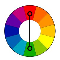
The design of the button has been tested over and over again. In the end the answer is: It depends on how it interacts with the rest of the page. People swear the red or green or orange convert better and they most likely did in that particular test. The bottom line is this: The color of your button must contrast with the background. Use this color wheel by selecting the opposite color for your background and button. If you have a button next to another button, try having them contrast as well. You can also put a border around the button to make it pop.
The shape of the button is not as important as the color, but it cannot hurt to test square edges vs. round edges. Try the opposite shape of your page. Remember – pretty landing pages do not always convert better.
Tip: Your call-to-action button should be the largest button on your page… really your only button.
Tip: A/B test your landing pages with different button text and colors. It is worth the time.
Building trust
Building trust is a very subtle thing. You cannot just say “trust me” in text. However, you can present confidence in a video. There are a number of techniques to build trust listed below. Remember the placement and order of these needs to be tested.
Testimonials – Testimonials are an easy thing to fake, so adding a picture of the person and a title will help. Keep testimonials relevant to the user’s main fear or concern. Shipping speed may not be as important as the product’s quality, time effectiveness or cost. More favorable is a product / service problem or support question being solved quickly.
Certifications and Logos – If you are part of an organization, placing the icon of that organization can be helpful. If a transaction is required, having the icon of the merchant processor, SSL certificate or other validation icon will increase the conversion rate at checkout.
Customer Logos – Customer logos show that the business is trusted by other companies. This is a simple way to present confidence with a few logo images.
Case Studies – Case studies are most helpful when they show the exact problem of the user being solved. Most case studies are not read but are skimmed for the facts. For complex sales and high ticket items the case study can close the deal or at least start a sales conversation.
Presenting Numbers or Data – Users love data and numbers. Starting a benefit with a number usually creates a higher conversion. Users trust facts. When using a percentage, include a couple decimal points. For example, “45.78%” saw an improvement with our miracle cure, compared to “45% saw an improvement with our miracle cure.”
Privacy Policy Statements – The “privacy policy” or “we do not spam” sentence under the CTA of a form needs to be tested carefully. Too much information can remind users of the risk. Try icons like a lock… “We hate spam and would never distribute your email…”
Letting the User Know What the Next Steps are in the Process – For multiform pages or process related requests, letting the user know what will happen next will reduce the fear of uncertainty. For example or a way to schedule\le in person, etc.
Trustworthy image – We are all human and an image of a trustworthy person to connect to unconsciously builds confidence and trust.
<<Previous | Table of Contents | Download the CRO Guide | Next >>

- How to Add a Chatbot to Your Ecommerce Website (Step-by-Step) - June 2, 2026
- How to Use a Chatbot for Lead Generation (And Actually Get Results) - May 26, 2026
- The Rise of Intelligent Websites - February 19, 2025