The Conversion Rate Optimization Guide
Chapter 8
<<Previous | Table of Contents | Download the CRO Guide | Next >>
Page layout and flow
Each page has a purpose, something you want the user to do. For those of you who took an art class, you may remember how some paintings can have a directional flow to them that causes your eyes to follow a path or line. Like a painting, a web page needs to be constructed such that the user’s eyes follow an unconscious path which ends at the call-to-action. In most cases, we want the user to go through this process:
- Gain some information and interact with the page.
- Make a decision.
- Take action.
Tip: Before you start laying out your page, take a minute and write down where the user needs to go mentally before taking action. For example, is this the right part? Will it fit my model? Does it have the same or better features? Is there a return policy? Is it affordable?…
To do this we have to help the user along with directional guidance. For example, a person looking at the form, a finger pointing, or graphic elements like arrows, line angles and trapezoid shapes will cause the user to look at the CTA, and this can have a dramatic effect on the conversion rate of the page.
Images, especially of the product or of people will affect your conversion rate. The product image has to pop. Tests on ecommerce sites show that the bigger product image can increase sales by over 50%.
When placing images of people on the page, one thousand assumptions are being made depending on the demographic of the user. Testing different types of people images must also be done for different ad campaigns or groups.
People naturally focus on the eyes first. This popular test below is a heat map using eye tracking software from Tobii Studio resulting from 106 people looking at the ad. Notice that more people spent time on the copy when the baby was looking at it.
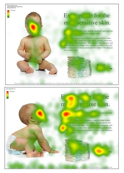
You can read more about this test by James Breeze at https://www.objectiveexperience.com/eye-tracking-ux-research/
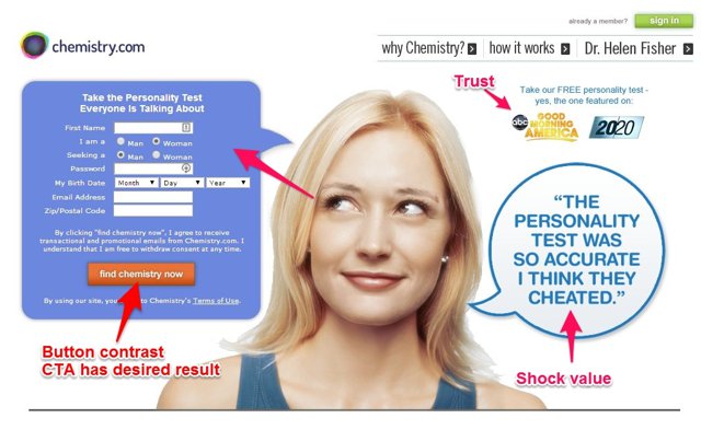
The example below has a number of important elements, but the first thing you see is the woman and then the form. The third may be the conversation bubble.
Look at your page layout from an artist’s point of view. Graphically, what shapes and images make you look at the call-to-action and/or form. Use human faces as much as possible. Review the image on your site and ask yourself:
- Does the image peak their attention?
- Does the image connect to the user subconsciously?
- Does the image persuade them and overcome objections?
- Does the image or layout point to the call to action?
Use heat map tools to understand how users are interacting with the site.
Use feedback tabs and pop-up surveys to query users and find out where they are getting stuck.
Tip: For landing pages with a download goal, make people curious by blurring the background image of the item so they cannot really read the details of what the downloadable item says. Ask questions that peak their curiosity, and have shocking info that makes them want it more.
Mobile and desktop design considerations
The user’s experience is affected by the device they are on. Designers are creating a site on a desktop then it is coded and viewed responsively (layout change depending on the device). Because of this, the desktop version may look great and the mobile version is an afterthought or vice versa. When testing, it is important to look at the conversion rate by device, often one device can cancel out the other. In some cases, a mobile only landing page is easier to test than a responsive page, depending on your testing platform. A mobile page is designed to scroll whereas the desktop often is not. This can cause conflicting results and design decisions.
<<Previous | Table of Contents | Download the CRO Guide | Next >>

- How to Add a Chatbot to Your Ecommerce Website (Step-by-Step) - June 2, 2026
- How to Use a Chatbot for Lead Generation (And Actually Get Results) - May 26, 2026
- The Rise of Intelligent Websites - February 19, 2025