Which test won? In this A/B test, we looked at three different CTA (Call-To-Action) buttons: Submit Registration in a gray button, Get Started in an orange button, and Watch Videos in an orange button. Variation C won with a lift of 75.1%. Variation B had a lift of 44.6%.
Orange is a powerful button color that tends to get higher conversions. Keep in mind that “Watch Videos” is less risky than “Get Started” or “Submit Registration,” which also contributes to the higher conversion rate. Users will often choose the less risky option when it comes to CTA buttons. 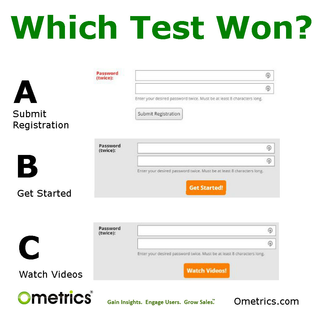

Greg Ahern Founder and CEO of Ometrics® and Ochatbot® is a fanatic about artificial intelligence, machine learning, AI chatbots, conversational ecommerce, lead generation and conversion rate optimization. Greg has been a successful Internet entrepreneur since 1994. He speaks at conferences and webinars and has built a number of internet businesses. You can follow Greg on Twitter @gregahern, Linkedin, and join his CRO Hacks Groups on Slack. https://www.ometrics.com/cro-growth-hacks/
Latest posts by Greg Ahern (see all)
- How to Add a Chatbot to Your Ecommerce Website (Step-by-Step) - June 2, 2026
- How to Use a Chatbot for Lead Generation (And Actually Get Results) - May 26, 2026
- The Rise of Intelligent Websites - February 19, 2025