Your potential customer is waiting for you to entice them. They’ve read your marketing material, they know what you you’re selling and they’ve thought long and hard about clicking the “buy” button you have on your sales page.
You’ve done everything you could do, and now you have to convince them to pull out their credit card and purchase what you’re offering. Even though you woo them with words and benefits, could there be something holding them back? Could it be something as simple as color?
Believe it or not, color has a lot to do with the way potential clients view your marketing messages, conversation pages and transactions. If you investigate further, you’ll see a variety of ways psychology and visual perception affects your business. Understand more about your target audience’s mind and emotions, and you’ll increase your conversion rate with a few tweaks on your website.
How your customers think in color
Depending on your target market, you’ll want to attract different customers with different hues. When you’re talking about customer rate optimization, knowing a bit about how color affects your sales copy will give you the knowledge that you need to boost your sales.
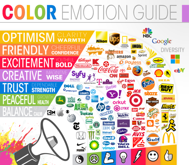
Traditionally, North Americans associate certain feelings with a particular color. For example, red tends to represents energy, strength and passion. This hue tends to be used in marketing for clearance sales, giving it a “better act now before it’s gone!” mentality.
Banks and businesses tend to use the color blue in their marketing materials, presenting a sense of confidence and security. Black is generally used to advertise luxury brands, giving off an attractive and powerful attitude.
For feminine products, you’ll likely see an array of pinks used to promote services for women and young girls. People tend to associate the color green with prosperity and wealth. It’s one of the easiest colors on the eyes, and it’s used to relax potential customers.
Out of all these colors, orange is great for call to action, buy or subscribe buttons. People associate a sense of assertiveness with this hue. 32% of the top 50 eCommerce sites use orange for the add to cart button.
Even though orange is a color that’s more likely to produce an action from your customer doesn’t mean all potential customers act this way. It’s important to consider the color treatment across your site that matches your market our target client. Here is more information on color.
Stand out using this psychological effect in your marketing
Even if you have great shades that complement your website and sales page, there’s another way to make use of color for your customers.
In 1933, a psychiatrist and pediatrician named Hedwig von Restorff delved into the study of memory. She examined how people treat information and lists of items when they’re presented information. She found that when people are given a list, they’re likely to remember the one item that’s a different color from the other items in the list.
The Von Restorff effect, also referred to as the isolation effect, is used in businesses now. Merely changing the color of your call-to-action box to be different from the rest of your page is enough to draw attention to it.
This technique also works with text inside a paragraph. Adding hyperlinks to the text and having the text a different color will increase the conversion rate. In the old days all hyperlinks were blue now many site have no color treatment on the text at all only a rollover color. Check your site and make sure your action words and other relevant topics are hyper-linked and have a color treatment.
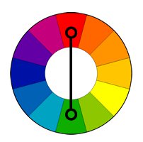
Although the color is important the contrast is more important. Use the color wheel below to find contrasting colors that will pop on your page.

In conclusion there is no particular color that kills conversions. It is a matter of matching the color with the audience and using contrast. Using these techniques will help fuel your conversion optimization and get your visitors to sign up for your emails or buy your products. Examine your website and experiment with colors that work physiologically and have call to action buttons and hyper-linked text contrast with the background.
Quick Tip: Logo files are notoriously confusing for designers and clients. When I worked at an agency we struggled to get clients to understand when to use a jpg. vs. a png. Check out this article that explains exactly when to use each of the six logo file formats.
- The Rise of Intelligent Websites - February 19, 2025
- Top Trending Products to Boost Your Shopify Store in 2024 - September 4, 2024
- AI Terms Glossary: Key AI Concepts You Should Know - August 22, 2024


